Smalls
Vision for Brand Voice
Well, look what the cat dragged in.
Hi Smalls Team,
What better way to demonstrate my brand vision and vocal wit than to show you what day one could look like? In this mock-up, I’ve explored some of the questions and conversations that might surface on day one, along with a glimpse of where my imagination could take the creative in the future.
Defiant by nature
Vision of Voice
I see two initial directions for how the language could evolve. The first begins from a dog-dominated world. This aligns with the bold vision you described in your role expectations and allows the brand to project a rebellious stance. It positions Smalls in the witty war between canine and feline. This approach is fun, provocative, and designed to spark conversation.
Witty, Selective, Defiant
A: “For animals that don’t beg.”
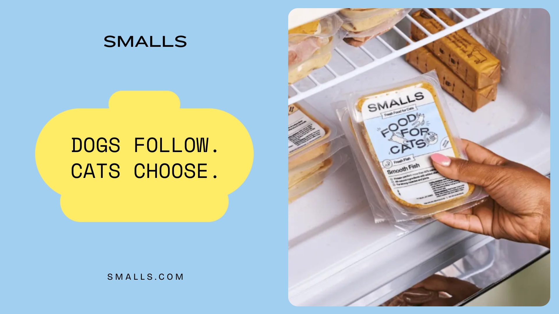
B: “Dogs follow. Cats choose.”
A: “Cats don’t settle. Neither do we.”
B: “Cats don’t compromise. Their food shouldn’t either.”
worthy by default
My one hesitation with Option 1 is that it still circulates the belief that cats are second best, at least in the broader cultural conversation. Defiance can feel like defense. Option 2 flips the narrative entirely. It leads with offense and, like cats themselves, assumes inherent worth. There is no war because cats already know they are the best.
Celebrated, Equal, Dignified
A: “Simply the best.”
B: “Nothing less than worthy”
A: “For your pickiest family member.”
B: “Trust their taste. They chose you.”
Strategic Application
As the brand voice develops, both directions can be tested. Option 1 offers boldness and a strong acquisition play that establishes Smalls as a cultural challenger. Option 2 lends itself to retention and education, building warmth and trust with cat parents over time. A thoughtful mix of both, tested and refined, will show us how the public responds to each mode and where the strongest resonance lies.
sniff to subscription
Lifestyle campaign flow
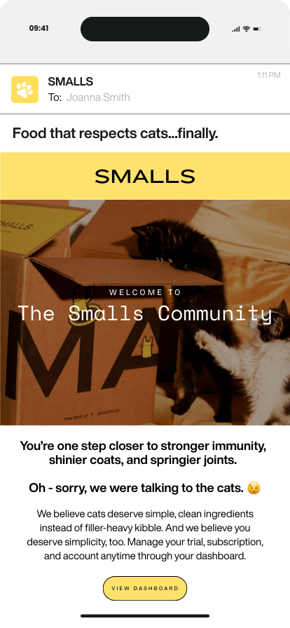
The first touchpoint after trial sign-up sets the tone for trust. We introduced Smalls as a brand built for cats, not compromises and immediately gave new customers transparent access to their account dashboard. This decision addresses common customer concerns around cancellation and reinforces Smalls’ value of clarity.
Email 1: Welcome to Trial & community
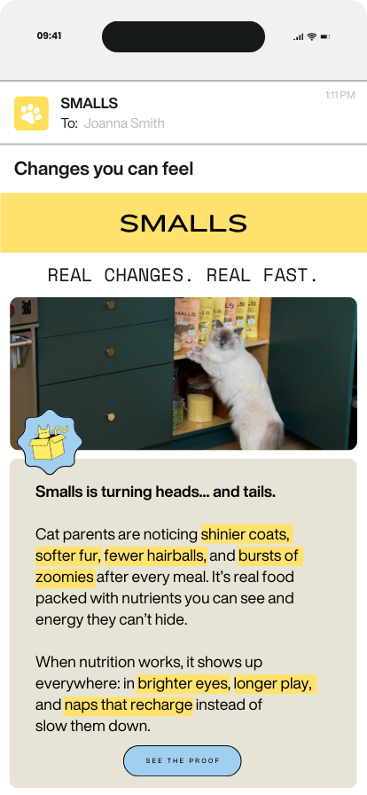
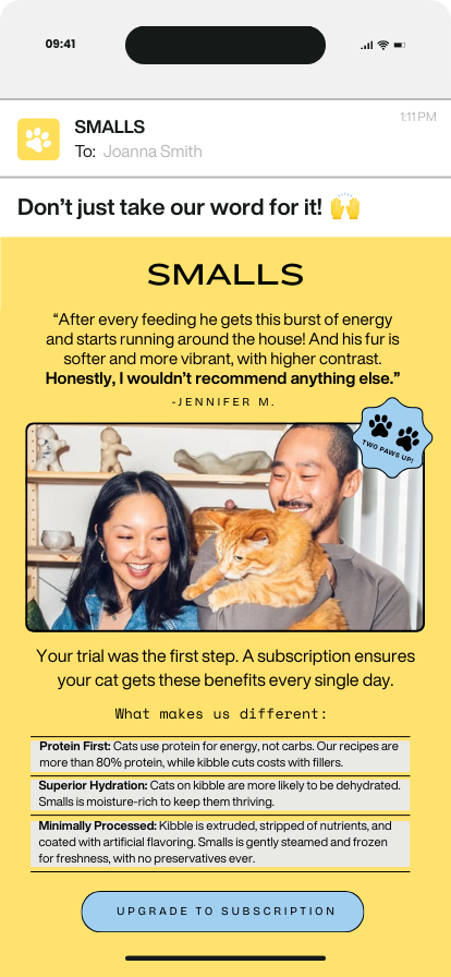
The first week of feeding is where doubt can creep in. This email highlights visible, tangible changes and ties them to Smalls’ benefits. The language is energetic and parent-validated, designed to reassure and inspire confidence before transaction and conversion.
Email 4: Value Reinforcement
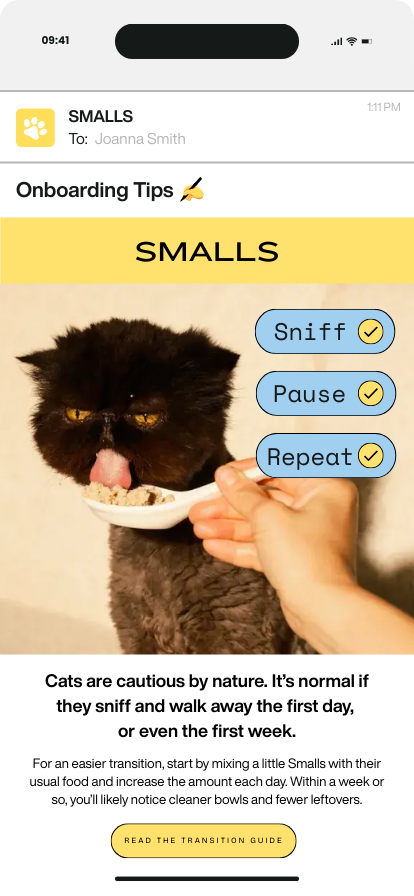
Transitioning can be tricky, and without guidance, cats may resist change. This email normalizes hesitation, provides clear steps, and positions Smalls as an empathetic partner who understands cat behavior. Reducing friction at this stage increases the chance of a successful trial-to-subscription conversion.
Email 2: Transitioning to Smalls
Once customers see value, they’re primed for subscription. Instead of relying only on discounting, this email educates with product differentiators (protein-first, hydration, minimally processed) and reinforces trust with social proof. The CTA focuses on upgrading the relationship, not just completing a purchase.
Email 5: Subscription nudge
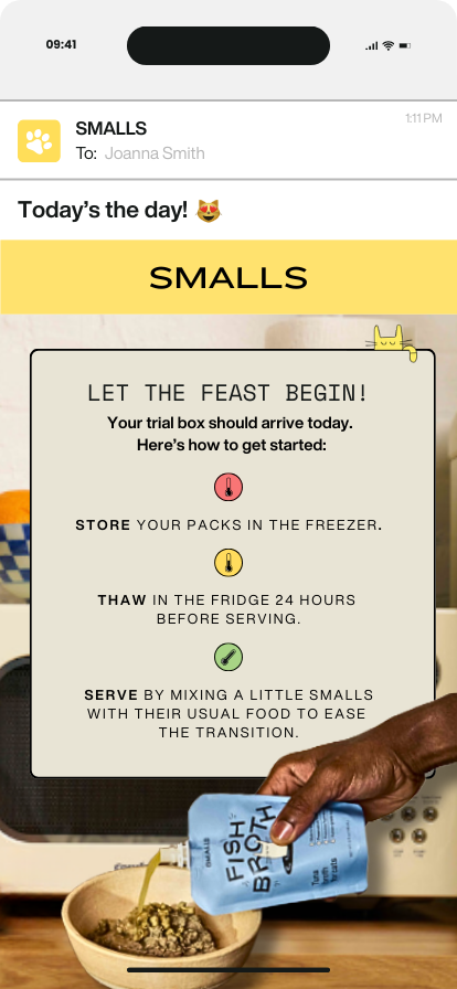
Trial customers need practical guidance at the moment of arrival. By framing shipping confirmation as a milestone, this email turns a transactional update into a brand experience. Storage and prep instructions help ensure a smooth transition for pet owner as well.
Email 3: Trial Box Arrival

Customers trust other cat parents. This email uses credibility signals (reviews, ratings, press logos) to close the gap between trial and long-term trust. The copy invites them to join the Smalls community, building both advocacy and belonging.
Email 6: Community & Social Proof
This mock lifecycle flow demonstrates how Smalls can guide new customers from a first trial to long-term subscription. I chose to showcase this because it highlights my ability to combine brand voice, customer psychology, and business goals into a cohesive journey. Each email balances wit with clarity, while addressing real customer concerns and reinforcing value at every stage.
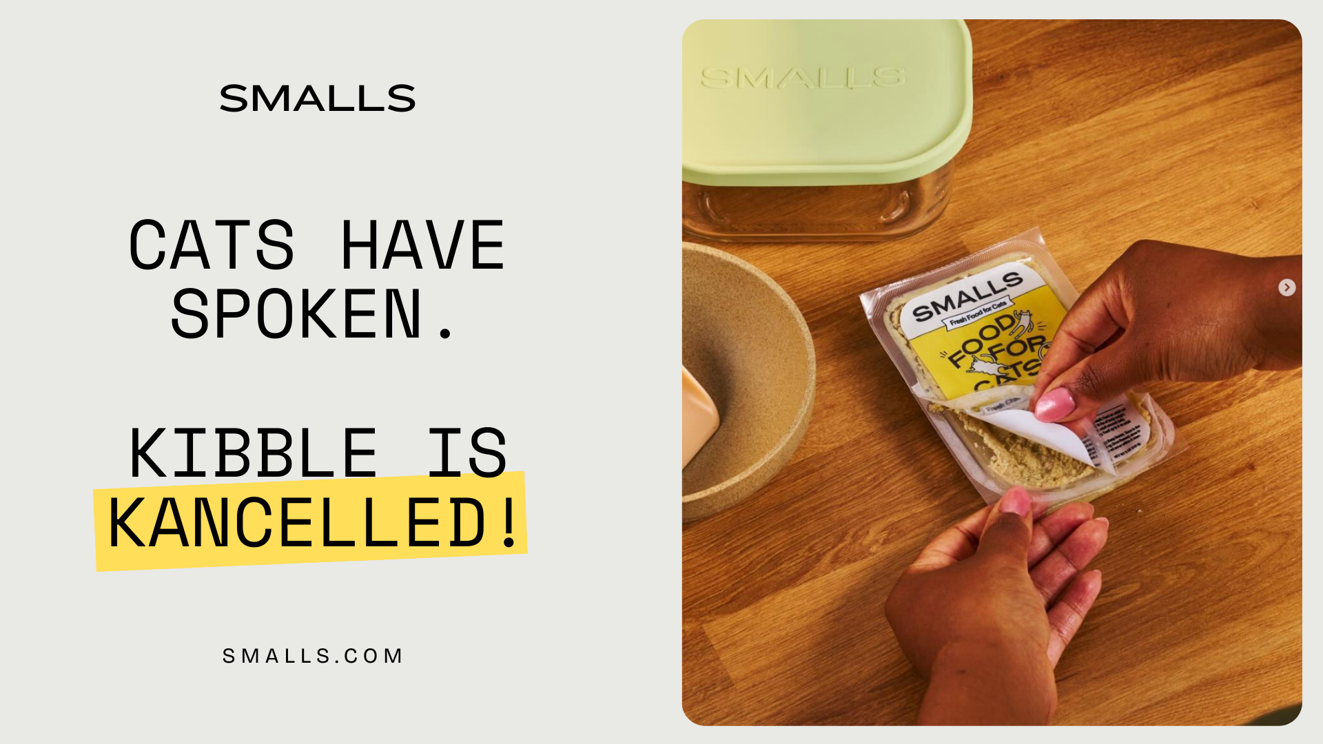
rebellion campaign concept
“kibble is kancelled!”
As you mentioned in the application expectations, you are looking for a fearless storyteller who is comfortable challenging industry conventions. I thought it would be fun to lean into the first option of the voice guide and explore bold, rebellious themes that spark conversation. This also leaves room to test against the second option, which highlights cats’ inherent worth and dignity. Together, the two approaches balance disruption with connection.
2: streetside banners (Product focused)
This version keeps the focus tight on the product itself, paired with the headline “Cats Don’t Settle. Cats Choose.” It’s a clean, minimalist way to reinforce the brand promise and put Smalls front and center. By tying the message directly to the product visual, it builds trust that what’s in the bag or box matches the bold claim.
1: billboard
This billboard uses bold, modern language like “cancelled” that feels current and playful. Taking a phrase that lives online and putting it on a huge outdoor board makes it surprising and fun. The clean design keeps the focus on the message, and the tone sets Smalls up as the challenger brand calling out kibble as outdated.
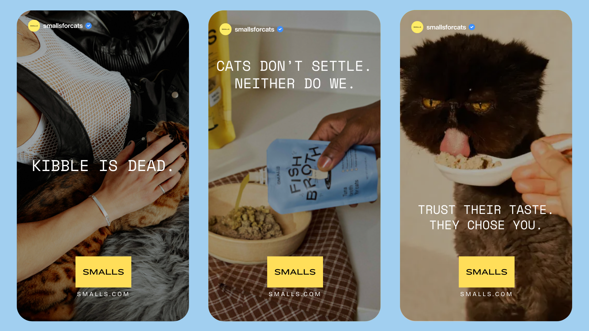
3. Social a/b testing (Instagram Stories)
Social is the place to experiment with tone. “Kibble is Dead” with a punk cat parent look leans into rebellion and grabs attention. “Cats Don’t Settle. Neither Do We.” shows Smalls’ selective, witty side. “Trust Their Taste. They Chose You.” softens it and connects emotionally with cat parents. By testing different styles, we see what resonates most while staying true to the brand.
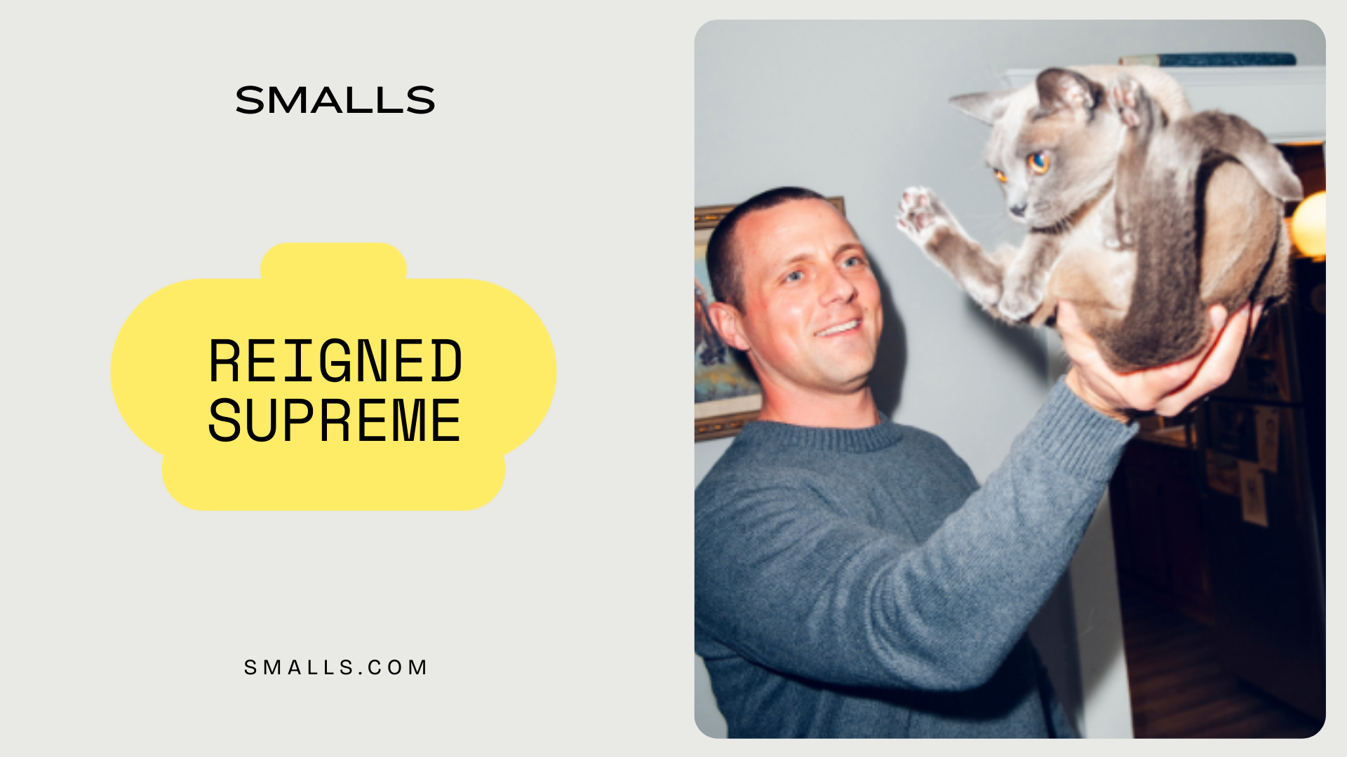
2: streetside banners (Lifestyle visual)
This version uses an image of a man casually holding his cat to humanize the brand and bring warmth to the campaign. Paired with “Reigned Supreme” and the crown graphic, it positions cats as elevated and in control, while still approachable. It adds personality and creates a moment of cultural storytelling rather than pure product marketing.
The campaign uses minimalist design and bold copy to balance approachability with edge. Each placement - billboard, street, social - builds on the same brand truth: cats demand better. By testing different tones in controlled channels (social), while keeping big public executions bold but approachable, the campaign both pushes boundaries and respects audience comfort, easing people into Smalls’ cat-first worldview.